Chapter 1 Linear regression review
Learning Objectives
We have 3 objectives in this first section:
- To review linear regression and its assumptions.
- To review important statistical concepts (i.e., sampling distributions, p-values, confidence intervals, and prediction intervals) in the context of linear regression.
- To sharpen your R skills.
1.1 R Packages
As with most chapters, we will load a few key packages upfront:
library(ggplot2) # for plots
theme_set(theme_bw()) # black and white background
library(dplyr) # for data wrangling
library(knitr) # for including graphics and changing output options
library(kableExtra) # for creating tables
# See https://haozhu233.github.io/kableExtra/bookdown/use-bootstrap-tables-in-gitbooks-epub.html
options(kableExtra.html.bsTable = T)
In addition, we will use data and functions from the following packages:
abdfor theLionNosesdata setLock5Datafor the cricket chirp data setcarfor a residual diagnostic plotggResidpanelfor residual plots using theresid_panelfunctionpatchworkfor creating a multi-panel plotperformancefor evaluating assumptions of the linear regression model
1.2 Data example: Sustainable trophy hunting of male African lions
We will review the basics of linear regression using a data set contained in the abd library in R (Middleton & Pruim, 2015).
These data come from a paper by Whitman, Starfield, Quadling, & Packer (2004), in which the authors address the impact of trophy hunting on lion population dynamics. The authors note that removing male lions can lead to increases in infanticide, but the authors’ simulation models suggest that removal of only older males (e.g., greater than 6 years of age) could minimize these impacts.3
How could a researcher (or hunter/guide) tell the age of a lion from afar, though? It turns out that it is possible to get a rough idea of how old a male lion is from the amount of black pigmentation on its nose (Figure 1.1; for more information on how to age lions, see this link).

FIGURE 1.1: The amount of black pigmentation on lions noses increases as the lions age.
The LionNoses data set in the abd library contains 32 observations of ages and pigmentation levels of African lions. To access the data, we need to make sure the abd package is installed on our computer (using the install.packages function). We then need to tell R that we want to “check out” the package (and data) using the library function.
install.packages("abd")  # only if not already installed
library(abd) # Each time you want to access the data in a new R session
We can then print the first several rows of data, showing the age of the observed lions and their respective levels of nose pigmentation.4.
##   age proportion.black
## 1 1.1             0.21
## 2 1.5             0.14
## 3 1.9             0.11
## 4 2.2             0.13
## 5 2.6             0.12
## 6 3.2             0.13
Let’s plot the data, showing the proportion of the lions’ noses that are black on the x-axis and the ages of each lion on the y-axis. We will also plot the best-fit line determined using linear regression (Figure 1.2).
ggplot(LionNoses, aes(proportion.black, age)) +
  geom_point() +
  geom_smooth(method = "lm", formula = y ~ x) +
  xlab("Proportion Black") +
  ylab("Age")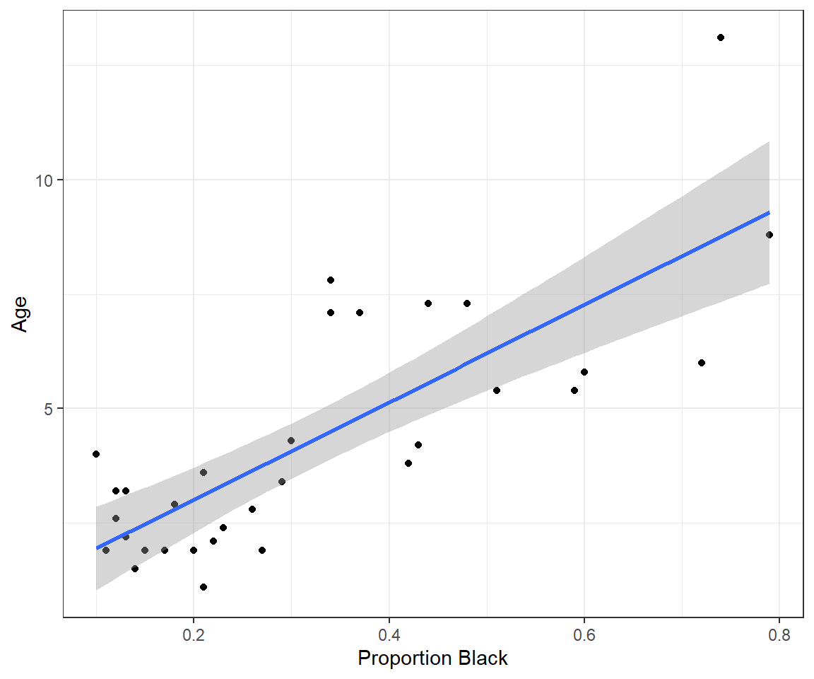
FIGURE 1.2: Lion age versus proportion of their nose that is black, along with a best-fit regression line.
Let’s also look at the fitted regression line:
##
## Call:
## lm(formula = age ~ proportion.black, data = LionNoses)
##
## Coefficients:
##      (Intercept)  proportion.black
##            0.879            10.647
Using the coefficients, we have the following linear model:
\[Y_i = 0.879 + (10.65)X_i + \epsilon_i\]
where \(Y_i\) is the age of the lion, \(X_i\) is the proportion of the lion’s nose that is black, and the \(\epsilon_i\)’s represents random variability about the regression line. We can predict the age of a lion, such as one with 40% of its nose black, by plugging in this value for \(X_i\) and setting \(\epsilon_i =0\):
\[\hat{Y_i} = 0.879 + (10.65)(0.4) = 5.14 \mbox{ (years old)}\]
Note, here and throughout the book, we will use the ^ symbol when referring to estimates of parameters or functions of parameters.
1.3 Interpreting slope and intercept
Let’s write the equation for the linear regression line in terms of the actual variables we used:
\[Age_i = 0.879 + 10.65Proportion.black_i+\epsilon_i\]
We can also write the model in terms of the expected or average age among lions that have the same level of pigmentation in their nose, \(E[Age | Proportion.black]\), by dropping the \(\epsilon_i\) term (since the \(E[\epsilon_i]=0\))5:
\[\begin{gather} E[Age | Proportion.black] = 0.879 + 10.65Proportion.black \tag{1.1} \end{gather}\]
The slope of the regression line, \(\beta_1 = 10.65\) tells us that the average \(Age\) changes by 10.65 years for each increase of 1 unit of \(Proportion.black\), i.e., 10.65 = \(\frac{\Delta E[Age]}{\Delta Proportion.Black}\). However, this number is difficult to interpret in this case because we cannot change \(Proportion.black\) by 1 unit (since all proportions have to be \(\le 1\)).
We could instead represent nose pigmentation using the percentage of the nose that is black. We add this variable to our data set using the mutate function in the dplyr package (Wickham, François, Henry, & Müller, 2021) and then refit our model using our new variable in place of our old one.
LionNoses <- LionNoses %>%
  mutate(percentage.black = 100*proportion.black)
lm.nose2 <- lm(age ~ percentage.black, data = LionNoses)
lm.nose2
##
## Call:
## lm(formula = age ~ percentage.black, data = LionNoses)
##
## Coefficients:
## (Intercept) percentage.black
## 0.8790 0.1065We see that our slope changes to 0.1065, suggesting that the average \(Age\) changes by 0.1065 years for each increase of 1 unit of \(percent.black\). This example highlights an important point: the magnitude of \(\beta\) is not very useful for deciding on the relative importance of different predictors since it is tied to the scale of measurement. If we change the units of a predictor variable from m to km, our \(\beta\) will change by three orders of magnitude (\(\beta_{km} = 1000\beta_m\)), yet the importance of the predictor remains the same. One strategy for addressing this issue is to scale predictors using their sample standard deviation, which can facilitate comparisons among coefficients in models that contain multiple predictors (Schielzeth, 2010); we will demonstrate this approach in Section 3.
To interpret the intercept, it helps to eliminate everything on the right hand side of the regression equation (equation (1.1)) except for the intercept. For example, if we set \(Proportion.black_i = 0\), we see that the intercept estimates the mean (or expected) \(Age\) of lions that have no black pigmentation on their nose:
\[\begin{gather} E[Age | Proportion.black = 0] = 0.879 \end{gather}\]
More generally,
The intercept = the average value of \(Y\) when all predictors are set equal to 0 (\(E[Y | X =0]\)).
The slope = predicted change in \(Y\) per unit increase in \(X\)
In many cases, interpreting the intercept will require extrapolating outside of the range of the observed data, and therefore the intercept may be misleading or biologically uninterpretable. To quickly illustrate, consider the simple example of predicting the outside temperature from the number of cricket chirps heard per minute (this is a famous data set often used in introductory statistics classes). The data are included in the Lock5Data package (R. Lock, 2017).
ggplot(CricketChirps, aes(Chirps, Temperature)) +
  geom_point() + geom_smooth(method = "lm", formula = y ~ x) +
  xlab("Chirps per minute") + ylab("Temperature (F)") +
  theme_bw()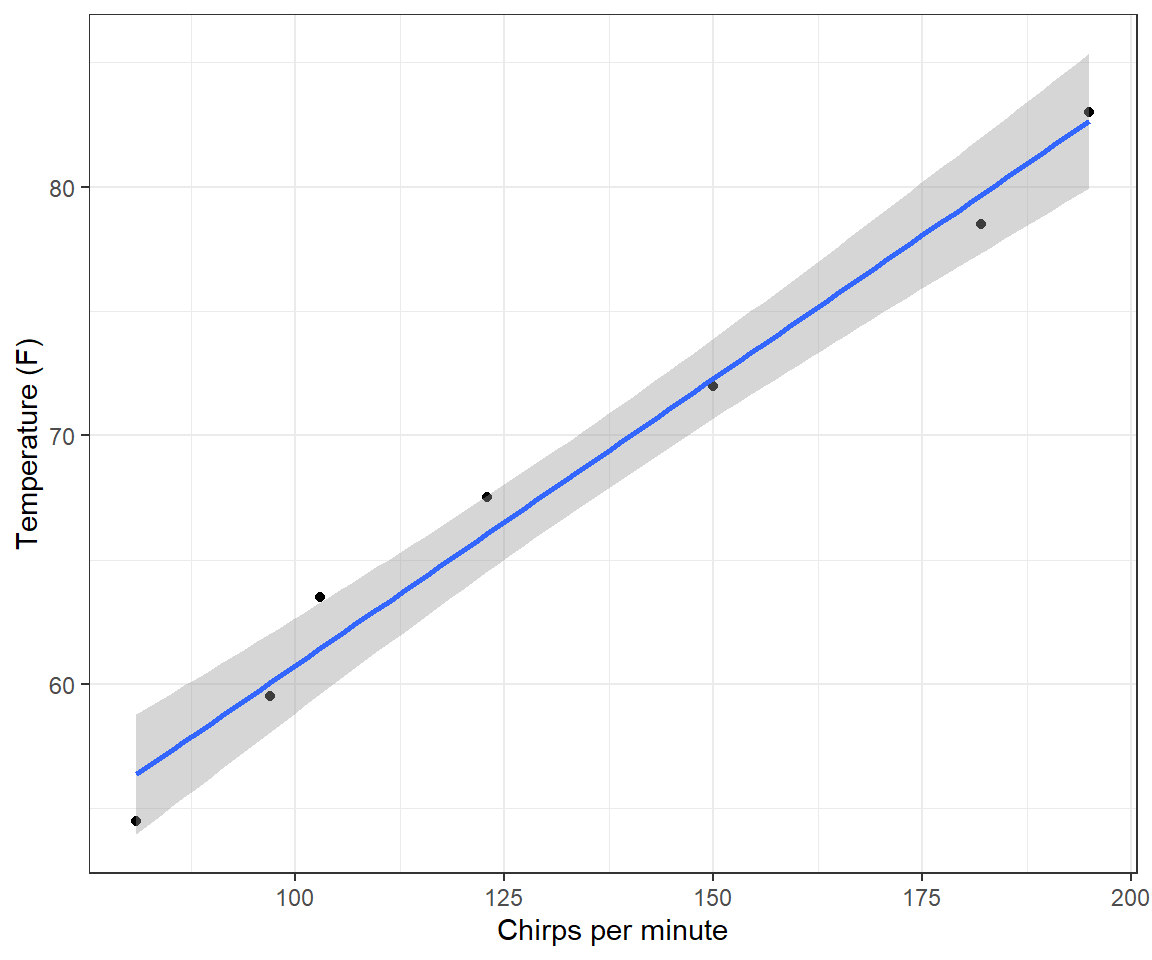
FIGURE 1.3: Linear regression model relating ambient temperature to cricket chirp rate.
##
## Call:
## lm(formula = Temperature ~ Chirps, data = CricketChirps)
##
## Coefficients:
## (Intercept)       Chirps
##     37.6786       0.2307
The intercept predicts that the average temperature will be 37\(^\circ\) degrees when crickets stop chirping. As the scatterplot clearly shows (Figure 1.3), this calculation requires extrapolating well outside of the range of the observed data. In fact, crickets stop chirping well before the temperature hits 37\(^{\circ}\) F, but we have no data at lower chirp rates or temperatures to inform the model that this is the case.
Often, it will be helpful to center predictors, which means subtracting the sample mean from all observations. This will create a new variable that has a mean of 0. An advantage of this approach is that our intercept now tells us about the average or expected value of \(Y\) when our original variable, \(X\), is set to its mean value instead of to 0. For example, we can fit the same model to the cricket data, below, but after having subtracted the mean number of Chirps in the data set6.
##   mean(Chirps)
## 1 133##
## Call:
## lm(formula = Temperature ~ I(Chirps - mean(Chirps)), data = CricketChirps)
##
## Coefficients:
## (Intercept) I(Chirps - mean(Chirps))
## 68.3571 0.2307In our revised model, the slope stays the same, but the intercept provides an estimate of the temperature when the number of Chirps per minute = 133, the mean value in the data set.
At this point, we have reviewed the basic interpretation of the regression model, but we have yet to say anything about uncertainty in our estimates or statistical inference (e.g., confidence intervals or hypothesis tests for the intercept or slope parameters). Statistical inference in frequentist statistics relies heavily on the concept of a sampling distribution (Section 1.6). To derive an appropriate sampling distribution, however, we will need to make a number of assumptions, which we outline in the next section.
1.4 Linear regression assumptions
Mathematically, we can write the linear model as:
\[\begin{equation} \begin{split} Y_i = \beta_0 + \beta_1X_i + \epsilon_i \\ \epsilon_i \sim N(0, \sigma^2), \end{split} \tag{1.2} \end{equation}\]
where we have assumed the errors, \(\epsilon_i\), representing deviations of each \(Y_i\) from the regression line, follow a Normal distribution with mean 0 and constant variance, \(\sigma^2\). Alternatively, we could write down the model as:
\[\begin{equation} Y_i \sim N(\mu_i, \sigma^2), \mbox{ with } \mu_i = \beta_0 + \beta_1X_i \tag{1.3} \end{equation}\]
In this alternative format, we have made it clear that we are assuming the distribution of \(Y_i\) is Normal with mean that depends on \(X_i\). The advantage of writing the model using eq. (1.3) is that this format is more similar to what we will use to describe generalized linear models that rely on statistical distributions other than the Normal distribution (e.g., Section 14).
The equations capture three of the basic assumptions of linear regression:
- Homogeneity of variance (constancy in the scatter of observations above and below the line); \(Var(\epsilon_i) = Var(Y_i | X_i) = \sigma^2\).
- Linearity: \(E[Y_i \mid X_i] = \mu_i = \beta_0 + X_i\beta_1\); this assumption tells us that the mean value of \(Y\) depends on \(X\) and is given by the line \(\mu_i = \beta_0 + X_i\beta_1\)
- Normality: \(\epsilon_i\), or equivalently, \(Y_i | X_i\) follows a Normal (Gaussian) distribution
In addition, we have a further assumption:
- Independence of the errors: Correlation\((\epsilon_i, \epsilon_j) = 0\) for all pairs of observations \(i\) and \(j\). This means that knowing how far observation \(i\) will be from the true regression line tells us nothing about how far observation \(j\) will be from the regression line.
Of the assumptions of linear regression, the assumptions of linearity and constant variance are often more important than the assumption of Normality (see e.g., Knief & Forstmeier, 2021 and references therein), especially for large sample sizes. As we will see when discussing maximum likelihood estimators (Section 10)7, one can often justify using a Normal distribution for inference when sample sizes are large due to the Central Limit Theorem.
Think-Pair-Share: How are these assumptions reflected in the Figure 1.4? How can we evaluate the assumptions of a linear regression using our data?
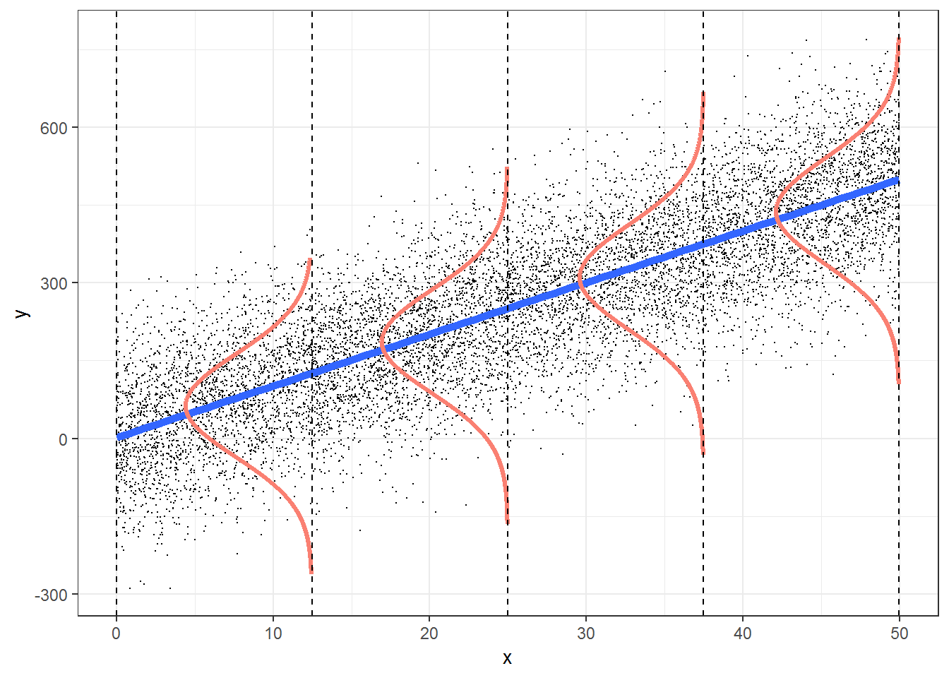
FIGURE 1.4: Figure illustrating the assumptions associated with simple linear regression. This figure was produced using modified code from an answer on stackoverflow by Roback & Legler (2021) (https://bookdown.org/roback/bookdown-bysh/).
1.5 Evaluating assumptions
We can use residual plots to graphically evaluate the assumptions of linear regression. A plot of residuals, \(r_i = (Y_i-\hat{Y}_i)\) versus predicted or fitted values \((\hat{Y}_i)\) can be used to evaluate:
- the linearity assumption (there should be no patterns as we move from left to right along the x-axis).
- the constant variance assumption (the degree of scatter in the residuals above and below the horizontal line at 0 should be the same for all fitted values).
Figure 1.5 depicts linear regression lines and plots of residuals versus fitted values for situations in which the assumptions are violated. In panel A), the linearity assumption is violated. This results in a non-linear trend in the residuals across the range of fitted values (panel C); \(Y\) is under-predicted for small and large values of \(X\) and overpredicted for moderate values of \(X\). In panel B), the data exhibit non-constant variance with larger residuals for larger values of \(X\). This assumption violation results in a fan-shaped pattern in the residual versus fitted value plot (panel D). This pattern is common to many count data sets and can be accommodated using a statistical distribution where the variance increases with the mean (e.g., Poisson or Negative Binomial; Section 15) or by using a model that explicitly allows for non-constant variance (Section 5).
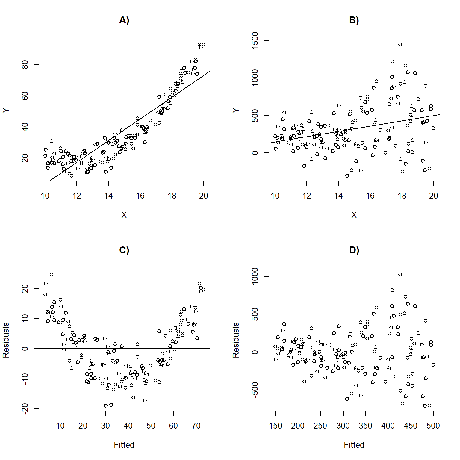
FIGURE 1.5: Linear regression lines with data overlayed and residual versus fitted values plots for situations in which the assumptions are violated. Panels (A, C) depict a situation where the linearity assumption is violated. Panels (B, D) depict a scenario where the constant variance assumption is violated.
1.5.1 Exploring assumptions using R
Linear regression objects in R have a default plot function associated with them, which we can use to evaluate the assumptions of linear regression. Let’s explore it using our regression model fit to the lion nose data set (Figure 1.6).
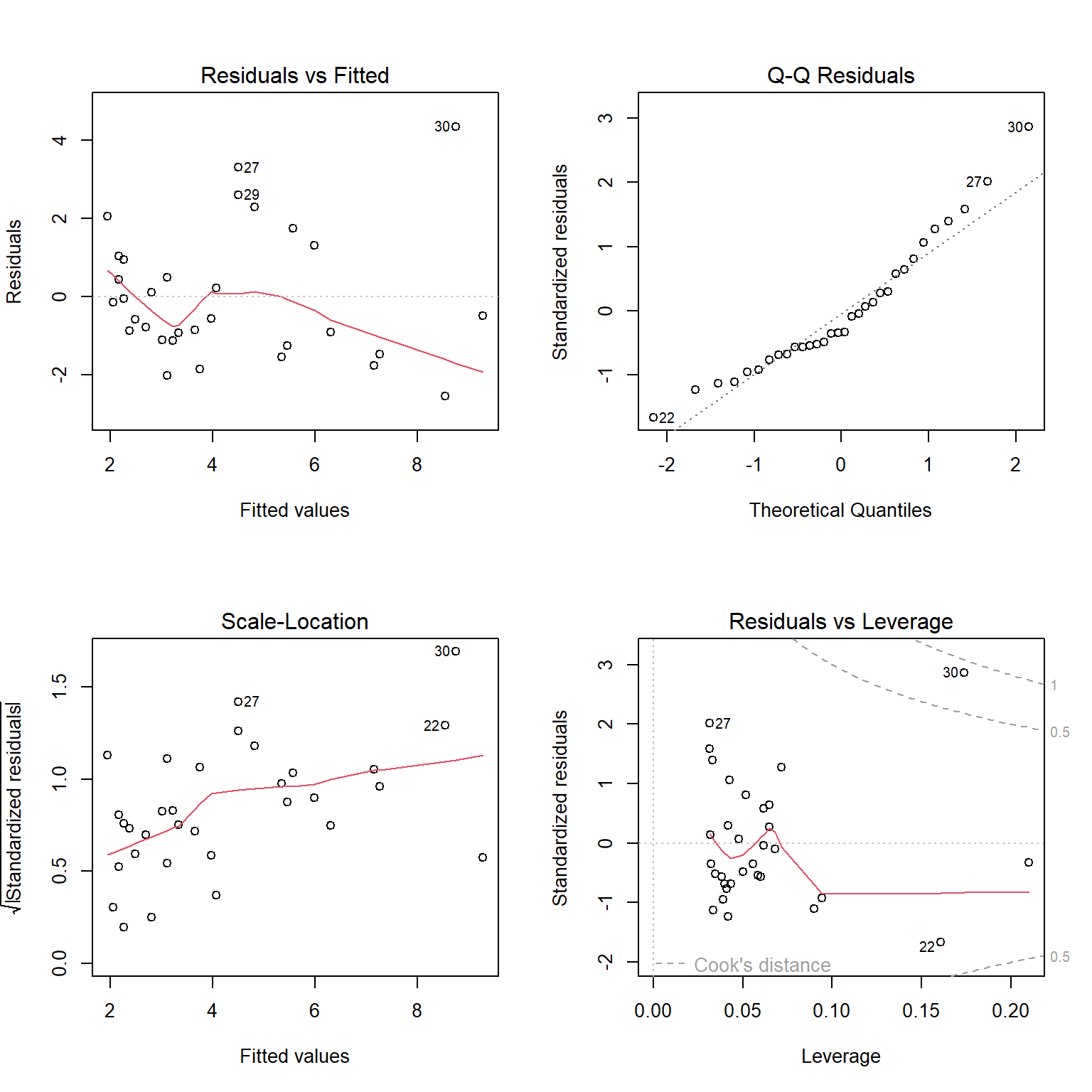
FIGURE 1.6: Residual diagnostic plots constructed using the plot function with a fitted linear regression model in R.
The top left panel of Figure 1.6 is our residual versus fitted value plot. The red line, included by default, is a smooth through the data and can be used to evaluate the linearity assumption. For small data sets, like this one, this line can be deceiving. To eliminate it, we could add add.smooth=FALSE to the plot function. The other 3 plots all use standardized residuals, which are also typically referred to as studentized residuals. Standardized residuals are formed by taking the residuals, \(Y_i - \hat{Y}_i\) and dividing them by an estimate of their standard deviation, \(\sqrt{\widehat{var}(r_i)}\). Standardized residuals offer a few advantages. First, if all assumptions hold, standardized residuals will follow a \(t-\)distribution with \(n - p\) degrees of freedom, where \(n\) is the sample size and \(p\) is the number of regression parameters in the model (two in the case of simple linear regression); thus, they provide an easy way to check for outliers (e.g., when \(n\) is large, we should expect roughly 99% of standardized residuals to occur between -3 and 3). Second, they will have constant variance, whereas non-standardized residuals will not. This latter advantage may seem surprising, especially since an assumption of the linear regression model is that the errors, \(\epsilon_i\), have constant variance. We must remember, however, that the residuals, \(r_i = Y_i - \hat{Y}_i\), are estimates of the errors, \(\epsilon_i = Y_i - E[Y_i|X_i]\). These estimates will be more variable as we move away from the average value of \(X\).
The top right panel of Figure 1.6 is a Q-Q plot, which shows quantiles of the standardized residuals versus quantiles of a standard Normal distribution. If the Normality assumption holds, we would expect to see the residuals largely fall along the dotted line indicating that the quantiles of the residuals (e.g., their 5th percentile, median, and 90th percentile, etc.) line up with the quantiles of the standard Normal distribution. In the lower left panel of of Figure 1.6, we see a plot of the square-root of absolute values of the standardized residuals versus fitted values. Here, we should see constant scatter along the x-axis if the constant variance assumption holds. Taking the absolute value of the residuals effectively reflects the negative residuals above the horizontal line \(y = 0\), making it easier to see departures from constant variance in small data sets. Lastly, the lower right panel plots residuals versus leverage, a measure of how far away each observation is in “predictor space” from the other observations. Observations with high leverage are often, but not always, highly influential points, meaning that deletion of these points leads to large changes in the regression parameters. In each of the panels, interesting and potentially problematic or influential points are indicated by their row number (which might suggest here that we should take a closer look at observations in rows 22, 27, 29, and 30).
Interpreting these plots usually involves some subjectivity. In the case of the lion nose data, the diagnostic plots look OK to me, though there is some evidence that the variance may increase as \(\hat{Y}\) increases (lower left panel of Figure 1.6); there are also a few potential outliers that show up in each of the panels that might be worth inspecting (e.g., to see if they could represent data entry errors or if there may be some other explanation for why they differ from most other observations).
It can be instructive to create diagnostic plots using simulated data for which all assumptions are met. It is also possible to add confidence bands to residual plots using what is referred to as a parametric bootstrap (i.e., by repeatedly simulating data from the fitted model). For example, the qqPlot function in the car package (Fox & Weisberg, 2019) will add confidence bands to facilitate diagnosing departures from Normality (Figure 1.7).
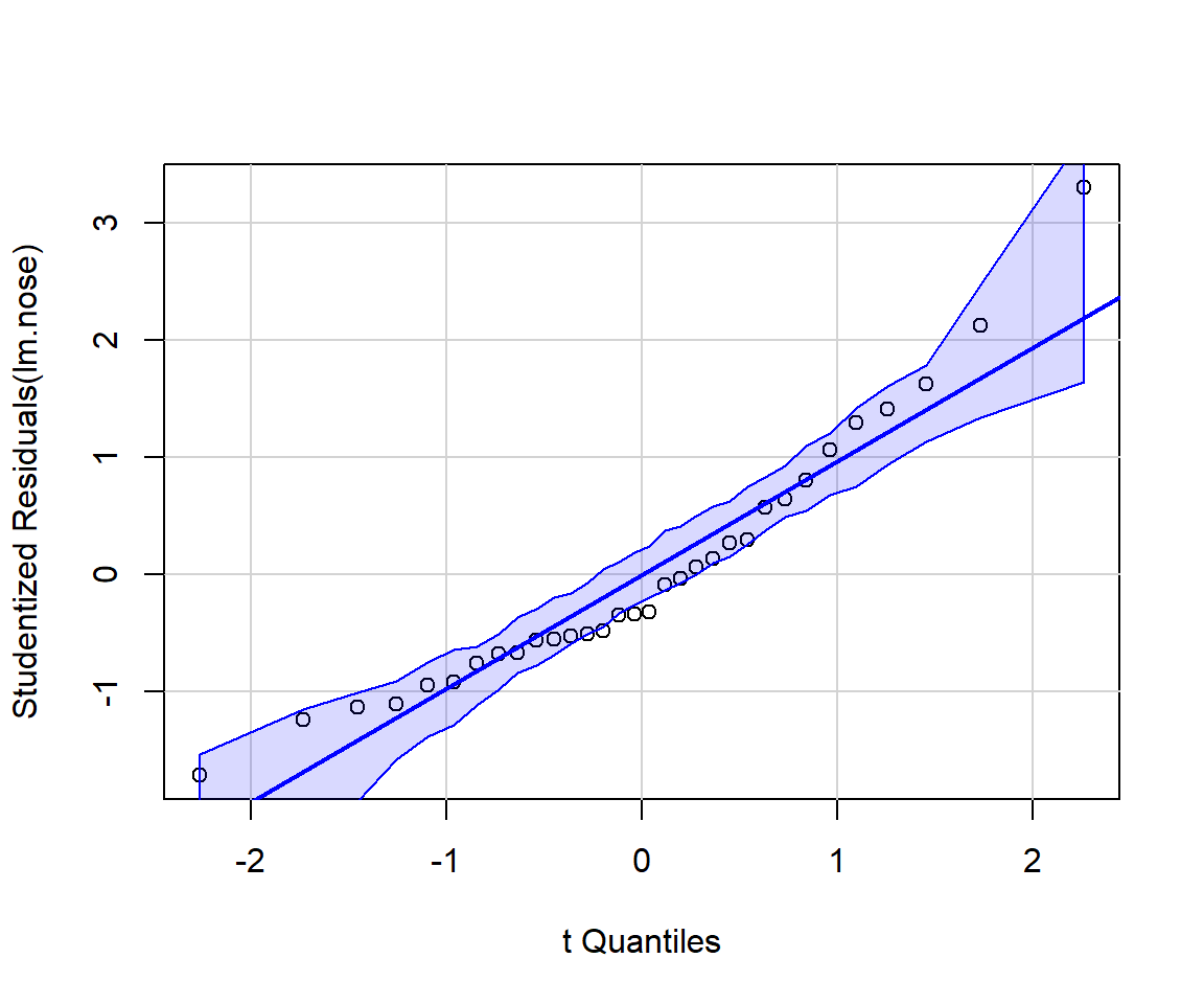
FIGURE 1.7: Output from running the qqplot function from the car package (Fox & Weisberg, 2019). If the Normality assumption is reasonable, we should expect most points to fall within the confidence bands, which are computed using a parametric bootstrap.
For a prettier set of residual plots, we could explore options in other packages. For example, the resid_panel function in the ggResidpanel package (Goode & Rey, 2019) provides the following 4 plots
- the typical residual versus fitted value plot (top left)
- a qqplot for evaluating Normality (top right)
- an index plot showing residuals versus observation number in the data frame (this could be useful for exploring the independence assumption if observations are ordered temporally or spatially)
- a histogram of residuals with a best-fit Normal distribution overlayed.
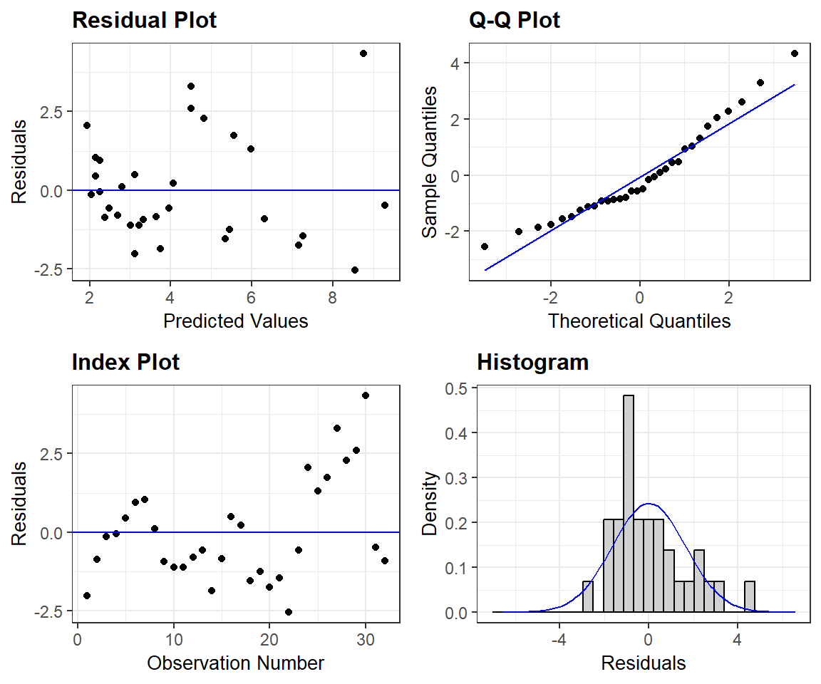
FIGURE 1.8: Residual plots constructed using the ggResidpanel package.
The plot_model function in the sjPlot package (Lüdecke, 2021) also provides the following diagnostic plots (with hints about what to look for in each plot):
- a qqplot and a density plot of the residuals to evaluate Normality
- a residual versus fitted value plot to evaluate linearity and constant variance
library(patchwork) # to create the multi-panel plot
dplots <- sjPlot::plot_model(lm.nose, type="diag")
((dplots[[1]] + dplots[[2]])/ dplots[[3]]) 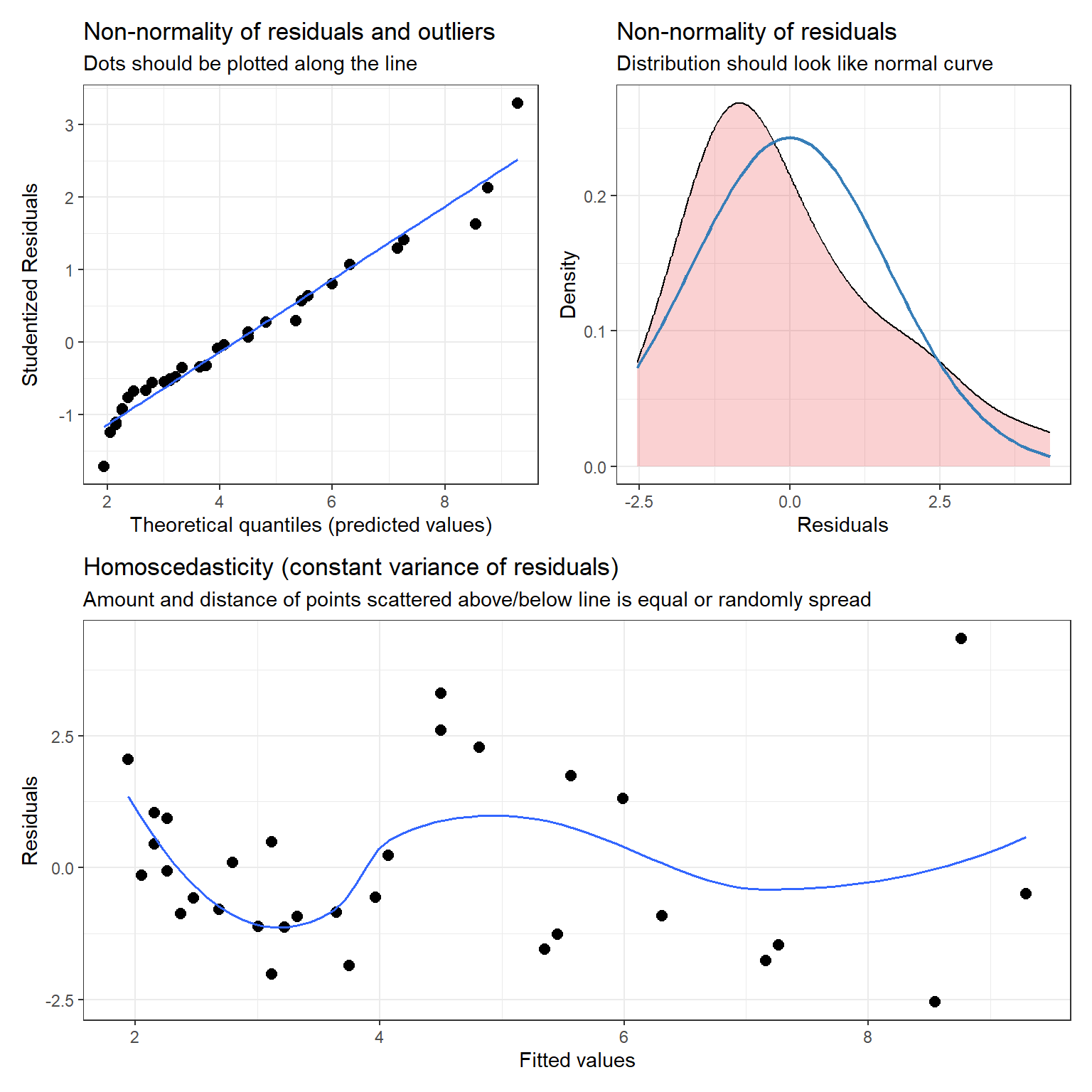
FIGURE 1.9: Diagnostic plots using the plot_model function in the sjPlot package.
Lastly, we will often use the check_model function in the performance` package (Lüdecke, Ben-Shachar, Patil, Waggoner, & Makowski, 2021), which offers a variety of different diagnostic plots (Figure 1.10).
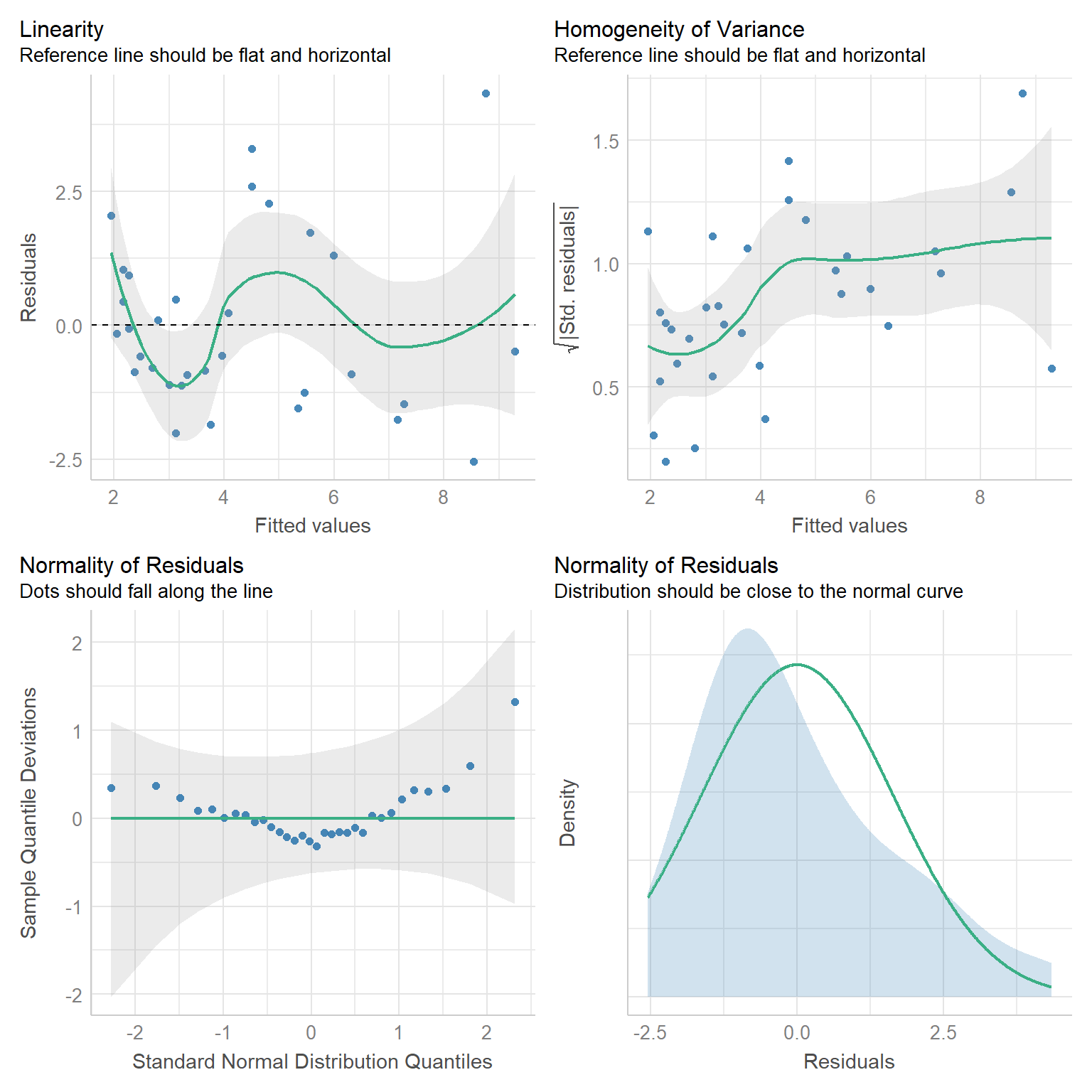
FIGURE 1.10: Diagnostic plots created using the check_model function of the performace package.
One thing to note here is that the performance package displays a detrended qqplot (lower left of Figure 1.10)), in which we expect the observations to fall near the horizontal line at y = 0 if all assumptions are met.
1.6 Statistical inference: Sampling distributions
R has a summary function that allows us to explore fitted regression models in more detail. Let’s have a look at the linear regression model we fit to the lion nose data.
Call:
lm(formula = age ~ proportion.black, data = LionNoses)

Residuals:
    Min      1Q  Median      3Q     Max
-2.5449 -1.1117 -0.5285  0.9635  4.3421

Coefficients:
                 Estimate Std. Error t value Pr(>|t|)
(Intercept)        0.8790     0.5688   1.545    0.133
proportion.black  10.6471     1.5095   7.053 7.68e-08 ***
---
Signif. codes:  0 '***' 0.001 '**' 0.01 '*' 0.05 '.' 0.1 ' ' 1

Residual standard error: 1.669 on 30 degrees of freedom
Multiple R-squared:  0.6238,    Adjusted R-squared:  0.6113
F-statistic: 49.75 on 1 and 30 DF,  p-value: 7.677e-08
Our goal should be to understand most of this output at a relatively high level. We have discussed the coefficient estimates in the summary table, but what about the Std. Error, t value, and Pr(>|t|) columns? The t value and Pr(>|t|) columns are associated with hypothesis tests for the slope and intercept parameters. Specifically, the first row provides a test statistic and p-value for the following null hypothesis test:
\(H_0\): \(\beta_0 = 0\) versus \(H_A\): \(\beta_0 \ne 0\),
where \(\beta_0\) is the intercept and \(H_0\) and \(H_A\) represent the null and alternative hypotheses. The second row provides a test statistic and p-value for testing whether the slope parameter is 0. You may have some notion of what a standard error represents (e.g., you might have used \(\pm 2SE\) to calculate approximate confidence intervals in the past). To really understand the inner workings of these different summaries, however, requires a firm grasp of sampling distributions. In frequentist statistics, we characterize uncertainty by considering the variability of our statistics (e.g., means, regression parameters, etc) across repeated random “trials.” To understand what a sampling distribution is, we must imagine (or simulate!) the process of repeatedly collecting new data sets of the same size as our original data set and using the same methods of data collection, and then analyzing these data in the same way as we did in our original analysis. We (almost) never take repeated samples in practice, which makes sampling distributions difficult to conceptualize. However, they are easy to explore using computer simulations.
Formally, a sampling distribution is the distribution of sample statistics computed for different samples of the same size, from the same population. A sampling distribution shows us how a sample statistic, such as a mean, proportion, or regression coefficient, varies from sample to sample. For an entertaining, and useful review, see:
FIGURE 1.11: Sampling distribution video, by Mr. Nystrom, an Advanced Placement Statistics Instructor who is very good at his craft! See: https://www.youtube.com/embed/uPX0NBrJfRI.
To understand the sampling distribution of our regression parameter estimators, we need to conceptualize repeating the process of:
- Collecting a new data set of the same size and generated in the same way as our original data set (e.g., by sampling from the same underlying population or by assuming the data generating process specified by our regression model can be replicated many times).
- Fitting the same regression model to these new data from step [1].
- Collecting the estimates of the slope (\(\beta_1\)) and intercept (\(\beta_0\)).
The sampling distribution of \((\hat{\beta}_0, \hat{\beta}_1)\) is the distribution of \((\hat{\beta}_0, \hat{\beta}_1)\) values across the different samples. The standard deviation of a sampling distribution is called standard errors (or SE for short).
1.6.1 Exploring sampling distributions through simulation
Let’s assume that the true relationship between the age of lions and the proportion of their nose that is black can be described as follows:
\[Age_i = 0.88 + 10.65Proportion.black_i+\epsilon_i\] \[\epsilon_i \sim N(0, 1.67^2)\]
Let’s generate a single simulated data set of size \(n = 32\).
# Sample size of simulated observations
n <- 32

# Use the observed proportion.black in the data when simulating new observations
p.black <- LionNoses$proportion.black

# True regression parameters
sigma <- 1.67 # residual variation about the line
betas <- c(0.88, 10.65) # Regression coefficients

# Create random errors (epsilons) and random responses
epsilon <- rnorm(n, 0, sigma) # Errors
y <- betas[1] + p.black*betas[2] + epsilon # Response
Now, having simulated a new data set, we can see how well we can estimate the true parameters \((\beta_0, \beta_1, \sigma)\) = (0.88, 10.65, 1.67).
Call:
lm(formula = y ~ p.black)

Residuals:
    Min      1Q  Median      3Q     Max
-3.2401 -0.8812 -0.3871  0.9053  3.2192

Coefficients:
            Estimate Std. Error t value Pr(>|t|)
(Intercept)   1.7028     0.5627   3.026  0.00505 **
p.black       8.9392     1.4934   5.986 1.45e-06 ***
---
Signif. codes:  0 '***' 0.001 '**' 0.01 '*' 0.05 '.' 0.1 ' ' 1

Residual standard error: 1.651 on 30 degrees of freedom
Multiple R-squared:  0.5443,    Adjusted R-squared:  0.5291
F-statistic: 35.83 on 1 and 30 DF,  p-value: 1.45e-06
As we might expect, the estimates of our parameters are close to the true values, but not identical to them (note the estimate of \(\sigma\) is given by the Residual standard error, equal to 1.651). We can repeat this process, and each time we simulate a new data set, we will get a different set of parameter estimates. This is a good time to introduce the concept of a for loop, which will allow us to repeat this simulation process many times and store the results from each simulation.
1.6.2 Writing a for loop
Usually, when it is convenient to do so, we will want to avoid writing code in R that requires the use of loops since loops in R can be slow to run. Nonetheless, there are times when loops are difficult to avoid and other times where they are incredibly convenient. Furthermore, a loop will help us to conceptualize the steps required to form a sampling distribution. In addition, for loops will feature prominently when we begin to write JAGS code for implementing models in a Bayesian framework.
When writing a for loop, I usually:
- Create a variable that will specify the number of times to run the operations to be repeated (
nsims, below). - Set up an object, such as a matrix or array, to store results computed during each iteration of the loop (e.g.,
sampmeans, below).
A for loop requires a for statement containing a counter (i, below) that can take on a set of values (1:nsims). Everything that needs to be executed repeatedly is then included between braces { }. As a relatively simple example, we could generate 1000 different sample means from data sets of size 100 generated from a \(N(5,3)\) distribution using:
# Number of simulated means
nsims <- 1000
# Set up a matrix to contain the nsims x 1 sample means
sampmeans<-matrix(NA, nrow = nsims, ncol = 1)
for(i in 1:nsims){ # i will be our counter
  #Save the ith sample mean from each iteration
  sampmeans[i] <- mean(rnorm(100, mean = 5, sd = 3))
}
head(sampmeans)
## [,1]
## [1,] 4.868652
## [2,] 5.304014
## [3,] 5.663501
## [4,] 5.463369
## [5,] 5.037228
## [6,] 5.098850Each time through the loop, R will generate 100 observations from a Normal distribution using the rnorm function and then take the mean of these values using the mean function. The result from the \(i^{th}\) time through the loop is stored in the \(i^{th}\) row of our sampmeans matrix.
1.6.3 Exercise: Sampling distribution
Let’s use a for loop to:
- Generate 5000 data sets using the code we wrote for simulating observations from the linear regression model with true parameters \((\beta_0, \beta_1, \sigma)\) = (0.88, 10.65, 1.67)
- Fit a linear regression model to each of these data sets
- Store \(\hat{\beta}_1\) in a 5000 x 1 matrix labeled
beta.hat
Each of these 3 steps (simulating data, fitting the model, and storing the results) should happen between the {} of your for loop. When you are done, calculate the standard deviation of the 5000 \(\hat{\beta}_1\)’s. This is an estimate of the standard error of \(\hat{\beta}_1\) – i.e., remember that the standard deviation of a statistic across repeated samples (i.e., the standard deviation of the sampling distribution) is referred to as the standard error of our statistic. This standard error is what is reported in the Std. Error column of the regression output (but, it is calculated analytically by the lm function rather than through simulation). It tells us how much we should expect our estimates to vary across repeated trials, where a trial represents collecting a new data set of the same size as the original data set and then fitting a linear regression model to that data set. This variability provides us with a useful measure to quantify uncertainty associated with our estimates, \(\hat{\beta}_0\) and \(\hat{\beta}_1\).
1.7 Sampling distribution of the t-statistic
You may recall from an introductory statistics class that the sampling distribution of standardized regression parameters follows a t-distribution with \(n-p\) degrees of freedom (provided all of our assumptions from Section 1.4 hold), where \(n\) is our sample size and \(p\) is the number of regression parameters in the model (2 in our case, an intercept and slope). Specifically,
\[\begin{equation*} \frac{\hat{\beta}_1-\beta_1}{\widehat{SE}(\hat{\beta}_1)} \sim t_{n-2} \end{equation*}\]
We can verify this result via simulation.
Think of many repetitions of:
- Collecting a new data set (of the same size as our original data set)
- Fitting the regression model
- Calculating: \(t = \frac{\hat{\beta}_1-\beta_1}{\widehat{SE}(\hat{\beta}_1)}\) (we can do this with simulated data since in this case we know the true \(\beta\))
A histogram of the different \(t\) values should be well described by a Student’s \(t\)-distribution with \(n-2\) degrees of freedom.
1.7.1 Class exercise: sampling distribution of the t-statistic
Let’s build on the previous exercise, adding one more step to our loop. For each fitted regression model, let’s store \(\hat{\beta}_1\) and calculate: \(t = \frac{\hat{\beta}_1-\beta_1}{\widehat{SE}(\hat{\beta}_1)}\).
Helpful hints:
- \(\beta_1\) = true value used to simulate the data = 10.65
- \(\hat{\beta}_1\) is extracted using:
coef(lm.temp)[2], wherelm.tempis the object holding the results of the regression for the \(i^{th}\) simulated data set. - \(\widehat{SE}(\hat{\beta}_1)\) is extracted using
sqrt(vcov(lm.temp)[2,2])
In Figure 1.12, I’ve included a histogram of my 5000 estimates, with a t-distribution with 2 degrees of freedom overlaid (a link to the code used to create the histogram can be found at the end of this chapter). As expected, the t-distribution provides a perfect fit to the sampling distribution.8 OK, next, we will consider how we can use this result to create a confidence interval for \(\beta_1\) or to calculate a p-value to test whether we have sufficient evidence to conclude that \(\beta_1 \ne 0\).
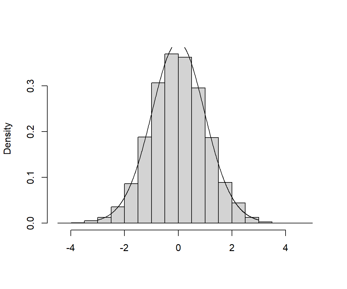
FIGURE 1.12: Sampling Distribution of the t-statistic, \(t = \frac{\hat{\beta}_1-\beta_1}{\widehat{SE}(\hat{\beta}_1)}\). A link to the code used to create the histogram can be found at the end of this chapter.
1.8 Confidence intervals
Here is how R. H. Lock et al. (2020) define confidence intervals:
A confidence interval for a parameter is an interval computed using sample data by a method that will contain the parameter for a specified proportion of all samples. The success rate (proportion of all samples whose intervals contain the parameter) is known as the confidence level.
The key to understanding confidence intervals is to recognize that:
- the parameter we are trying to estimate is a fixed unknown (i.e., it is not varying across samples)
- the endpoints of our confidence interval are random and will change every time we collect a new data set (the endpoints themselves actually have a sampling distribution!)
Consider repeating the process of randomly sampling from the same population (or, generating new data sets based on the same underlying data-generating model). If we estimate the same parameter and calculate a 95% confidence interval for that parameter with each of these data sets, we should expect that 95% of our intervals should contain the true population parameter. The actual proportion of intervals that contain the true parameter is referred to as the coverage rate.
To construct a confidence interval for \(\beta\), we will rely on what we just showed to be true, i.e., that:
\[\begin{equation*} \frac{\hat{\beta}_1-\beta_1}{\widehat{SE}(\hat{\beta}_1)} \sim t_{n-2} \end{equation*}\]
For the lion data set, we had an \(n = 32\), so let’s look at the \(t\)-distribution with 30 degrees of freedom (Figure 1.13).
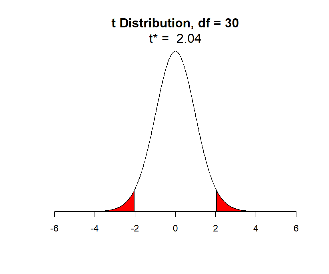
FIGURE 1.13: t-distribution with n-2 degrees of freedom. Shaded red areas demark the outermost 2.5% of the distribution on each side.
In Figure 1.13, I have shaded in red the outer 2.5% of the \(t\)-distribution (on both sides), leaving unshaded, the middle 95% of values of the distribution. We can determine the quantiles, sometimes referred to as the critical values, that demarcate these shaded areas using the qt function in R (here q stands for quantile and t for the \(t-\)distribution). These quantiles are given by:
## [1] -2.042272 2.042272As an aside, we could use the qnorm function to determine the 2.5\(^{th}\) and 97.5\(^{th}\) quantiles of a Normal distribution in much the same way:
## [1] -1.959964 1.959964The quantiles of the t-distribution are slightly larger in absolute value than those of a Normal distribution since the t-distribution has “wider tails” (it is more spread out than a Normal distribution).
So, we know that 95% of the time when we collect and fit a linear regression model, \(\frac{\hat{\beta}-\beta}{\widehat{SE}(\hat{\beta})}\) will fall between -2.04 and 2.04 as long as the assumptions from Section 1.5 are met. This allows us to write a probability statement (eq. (1.4)) from which we can derive the formula for a 95% confidence interval for \(\beta_1\):
\[\begin{equation} P(-2.04 < \frac{\hat{\beta}-\beta}{\widehat{SE}(\hat{\beta})} < 2.04) = 0.95 \tag{1.4} \end{equation}\]
From here, we just use algebra to derive the formula for a 95% confidence interval, \(\hat{\beta}\pm 2.04\widehat{SE}(\hat{\beta})\):
\[\begin{eqnarray*} P(-2.04 < \frac{\hat{\beta}-\beta}{\widehat{SE}(\hat{\beta})} < 2.04) = 0.95 \\ \Rightarrow P(-2.04\widehat{SE}(\hat{\beta})< \hat{\beta}-\beta < 2.04\widehat{SE}(\hat{\beta})) = 0.95 \\ \Rightarrow P(-\hat{\beta}-2.04\widehat{SE}(\hat{\beta})< -\beta <-\hat{\beta}+ 2.04\widehat{SE}(\hat{\beta})) = 0.95 \\ \Rightarrow P(\hat{\beta}+ 2.04\widehat{SE}(\hat{\beta})> \beta > \hat{\beta}- 2.04\widehat{SE}(\hat{\beta})) = 0.95 \\ \end{eqnarray*}\]
Thus, if our linear regression assumptions are valid, and if we consider repeating the process of (collecting data, fitting a model, forming a 95% confidence interval using \(\hat{\beta}\pm 2.04\widehat{SE}(\hat{\beta})\)), we should find that the true \(\beta\) is contained in 95% of our intervals. Hopefully, this helps clarify the definition given by R. H. Lock et al. (2020):
A confidence interval for a parameter is an interval computed from sample data by a method that will capture the parameter for a specified proportion of all samples.
In R, we can also use the confint function to calculate the confidence interval directly from the linear model object.
                      2.5 %    97.5 %
(Intercept)      -0.2826733  2.040686
proportion.black 7.5643082 13.729931Interpretation: We say that we are 95% sure that the true slope (relating the proportion of nose that is black to a lion’s age) falls between 7.56 and 13.73. We are 95% sure, because this method should work 95% of the time!
False interpretation: It is tempting to say there is a 95% probability that \(\beta\) is in the interval we have constructed. Technically, this is an incorrect statement, at least as far as frequentist statistics go. For any particular interval, \(\beta\) is either in the interval or it is not (the probability is either 0 or 1). We just don’t know which situation applies for our particular interval. We will see later, however, that this type of interpretation can be used with Bayesian credibility intervals (Section 11).
1.8.1 Exercise: explore confidence intervals through simulation
Let’s simulate another 5000 data sets in R, this time adding code to:
- Determine 95% confidence limits for each simulated data set.
- Determine whether or not each CI contains the true \(\beta_1\).
- Estimate the coverage rate as the proportion of the 5000 confidence intervals that contain the true \(\beta_1\).
To hammer home that the limits of a confidence interval have a sampling distribution, I plotted estimates of \(\beta_1\) and their associated confidence intervals for 100 simulated data sets (Figure 1.14). The solid vertical line shows us the true \(\beta_1\) (a fixed, non-varying parameter). With each simulated data set, we get a different estimate and a different confidence interval. The green intervals contain the true parameter and the red ones do not. On average, 95% of the intervals should be green and contain the true parameter.
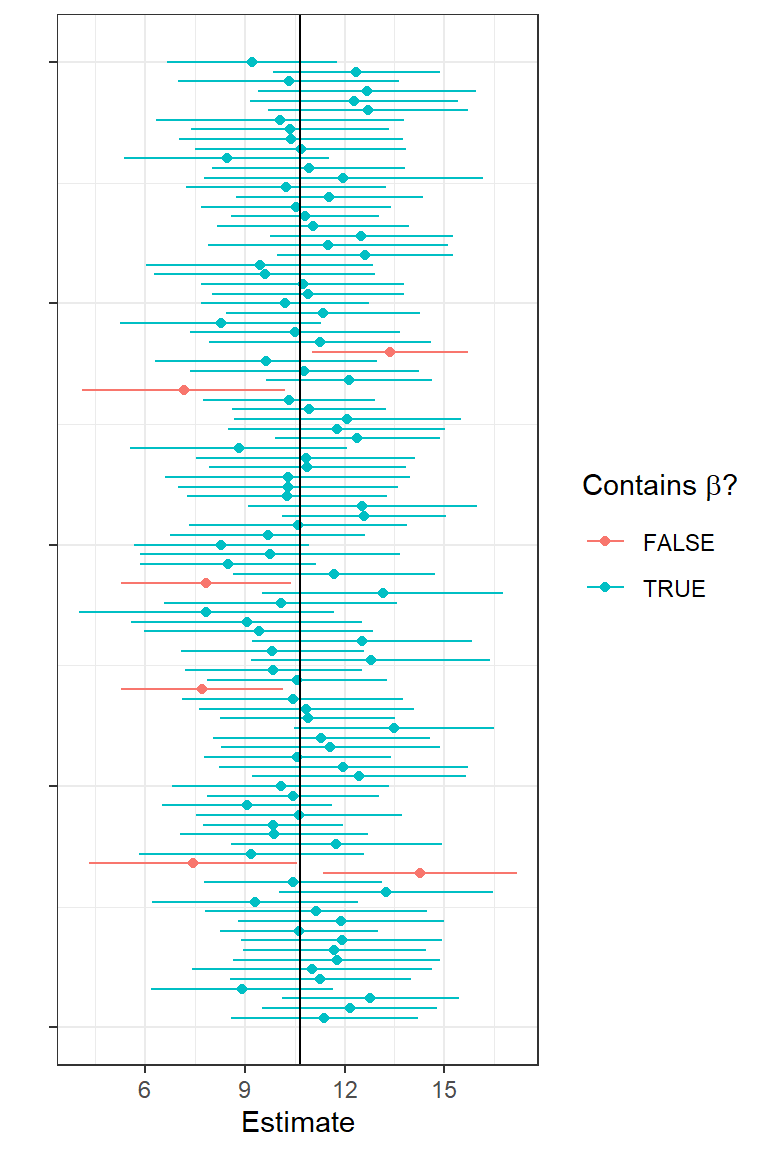
FIGURE 1.14: First 100 confidence intervals associated with the simulated data from the lion nose regression model. Points give estimates of the slope parameter and lines indicate 95% confidence intervals. Green intervals capture the true parameter value used to simulate the data and red intervals do not capture this parameter value.
1.9 Confidence intervals versus prediction intervals
The past few sections covered methods for quantifying uncertainty in our regression parameter estimators (using SE’s and confidence intervals). How do we quantify uncertainty associated with the predictions we derive from our model? Well, that depends on whether we are interested in the average age of lions with a specific proportion of their nose that is black (\(\hat{\mu}_i\)) or we are interested in the age of a specific lion (singular), \(\hat{Y_i}\).
In the former case, we are interested in a confidence Interval for the mean (synonymous with the location of the regression line) for a given value of \(X\), whereas in the latter case, we are interested in a prediction interval associated with a particular case.
A (1-\(\alpha\))% confidence interval will capture the true mean \(Y\) at a given value of \(X\) (1-\(\alpha\))% of the time.
A (1-\(\alpha\)) prediction interval will capture the \(Y\) value for a particular case (or individual) (1-\(\alpha\))% of the time.
We can calculate confidence and prediction intervals using the predict function.
newdata <- data.frame(proportion.black = 0.4)
predict(lm.nose, newdata, interval = "confidence", level = 0.95)
fit lwr upr
1 5.137854 4.489386 5.786322 fit lwr upr
1 5.137854 1.668638 8.60707This tells us that we are 95% sure that the mean age of lions with noses that are 40% black is between 4.49 and 5.79. And, we can be 95% sure that the age of a randomly chosen individual lion that has 40% of its nose black will fall between 1.67 and 8.60. Note the prediction interval is considerably wider. Why? The prediction interval must consider not only the uncertainty in the location of the regression line but also the variability of the points around the line. Remember, this variability is represented by a Normal distribution (see Figure 1.4) and is quantified using the residual standard error:
\[\hat{\sigma}=s_{\epsilon} = \sqrt{\sum_{i=1}^n{\frac{(y_i-\hat{y}_i)^2}{n-2}}}\]
We plot confidence and prediction intervals across the range of observed \(X\) values, below:
newdata <- data.frame(proportion.black = seq(0.08, 0.81, length = 100))
predict.mean <- cbind(newdata, predict(lm.nose, newdata, interval = "confidence"))
predict.ind <- cbind(newdata, predict(lm.nose, newdata, interval = "prediction"))
ggplot(LionNoses, aes(proportion.black, age)) +geom_point() +
  geom_line(data=predict.mean, aes(proportion.black, lwr), color="red", linetype = "dashed") +
  geom_line(data=predict.mean, aes(proportion.black, upr), color="red", linetype = "dashed") +
  geom_line(data=predict.ind, aes(proportion.black, lwr), color="black", linetype = "dashed") +
  geom_line(data=predict.ind, aes(proportion.black, upr), color="black", linetype = "dashed") +
  geom_line(data = predict.mean, aes(proportion.black, fit)) +
  xlab("Proportion black") + ylab("Age")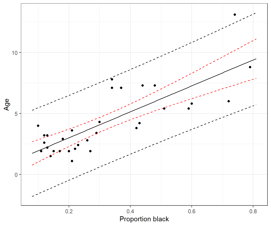
FIGURE 1.15: Confidence and prediction intervals for the regression line relating the age of lions to the proportion of their nose that is black.
1.10 Hypothesis tests and p-values
Let’s next consider the t value and Pr(>|t|) columns in the summary output of our fitted regression model. Before we do this, however, it is worth considering how null hypothesis tests work in general. In essence, null hypothesis testing works by: 1) making an assumption about how the world works (more specifically, assumptions about the processes that gave rise to our data9; these assumptions are captured by our null hypothesis); 2) deducing what sorts of data we should expect to see if the null hypothesis is true; 3) determining if our observed data are plausible in light of these expectations; and 4) (potentially) making a formal conclusion about the null hypothesis based on the level of plausibility of the data given the null hypothesis.
Null hypotheses are typically (though not always) framed in a way that suggests that there is nothing interesting going on in the data – e.g., there is no difference between treatment groups, the slope of a regression line is 0, the errors about the regression line are Normally distributed, etc. We then look for evidence in the data that might suggest otherwise (i.e., that the null hypothesis is false). If there is sufficient evidence to suggest the null hypothesis is false, then we reject it and conclude that the alternative must be true (i.e., there is a difference between treatment groups, the slope of the regression line is not 0, the errors are not Normally distributed). If we reject the null hypothesis, then the next step should be to determine if the patterns are strong enough to be of interest to us. In other words, are the differences between treatment groups big enough that we should care about them? Is the slope of the regression line sufficiently different from 0 to indicate a meaningful relationship between explanatory and response variables? Is the distribution of the errors sufficiently different from Normal that we might worry about the impact of this assumption on our inferences. If the hypothesis test focuses on a population parameter (e.g., a difference in population means or a regression slope), then we should follow up by calculating a confidence interval to determine values of the parameter that are consistent with the data (i.e., we cannot rule out any of the values that lie within the confidence interval).
Importantly, if we fail to reject the null hypothesis that does not mean that the null hypothesis is true! We just lack sufficient evidence to conclude it is false, and lack of evidence may be due to having too small of a sample size. If we fail to reject the null hypothesis, we should again consider a confidence interval to determine if we can safely rule out meaningful effect sizes (e.g., by examining whether a confidence interval excludes them).10
How do we measure evidence against the null hypothesis or the degree to which the data deviate from what we would expect if the null hypothesis were true? First, we need to choose a test statistic to summarize our data (e.g., a difference in sample means, a regression slope, or a standardized version of these statistics where we divide by their standard error). We are free to choose any statistic that we want, but it should be sensitive to deviations from the null hypothesis – i.e., the distribution of the statistic should be different depending on whether the null hypothesis is true versus situations that deviate substantially from the null hypothesis. We then calculate the probability of getting a statistic as extreme or more extreme than our observed statistic when the null hypothesis is true. This probability, our p-value, measures the degree of evidence against the null hypothesis.
1.10.1 Formal decision process
When used as part of a formal decision process, p-values get compared to a significance level, \(\alpha\); often this significance level is arbitrarily set to \(\alpha = 0.05\). If the p-value is less than \(\alpha\), we reject the null hypothesis; otherwise, we fail to reject the null hypothesis. This decision process is often compared to decisions in a court of law (Figure 1.16), with 4 potential outcomes:
If the Null hypothesis is true, we may:
- Correctly fail to reject it.
- Reject it, leading to what is referred to as a type I error with probability \(\alpha\).
If the null hypothesis is false, we may:
- Correctly reject it.
- Fail to reject it, leading to a what is referred to as a type II error with probability \(\beta\).
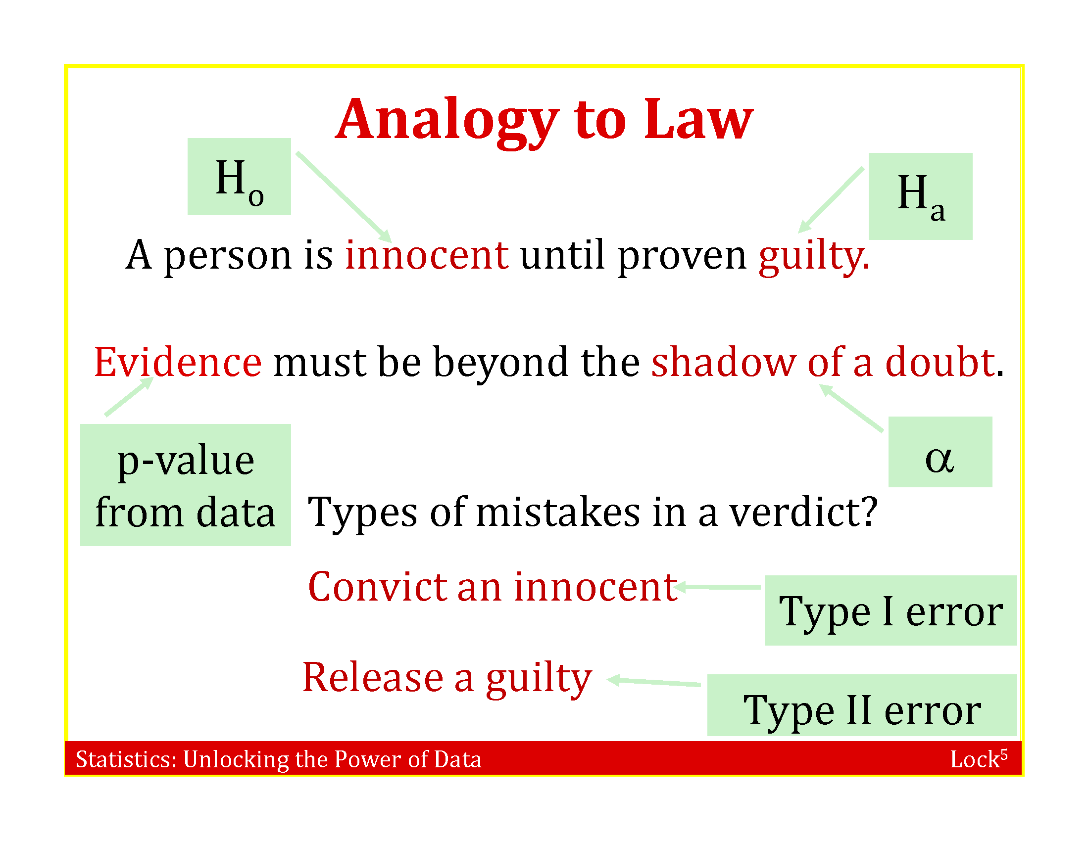
FIGURE 1.16: Slide accompanying the textbook, R. H. Lock et al. (2020), that makes the analogy between Null Hypothesis testing and decisions in a court of law.
If you are familiar with the story, A boy who cried wolf, it may help with remembering the difference between type I and type II errors. In the story, a boy tasked with keeping watch over a town’s flock of sheep amuses himself by yelling “Wolf!” and seeing the townspeople run despite knowing that there are no wolves present. Eventually, a wolf shows up and the townspeople ignore the boy’s call when a wolf is actually present. If we consider the null hypothesis, \(H_0\), that no wolf is present, the townspeople can be thought of as making several type I errors (falsely rejecting the null hypothesis) before committing a type II error (failing to reject the null hypothesis).
1.10.2 Issues with null hypothesis testing
Null hypothesis testing has been criticized for many good reasons (see e.g., D. H. Johnson, 1999). Some of these include:
The arbitrary use of \(\alpha = 0.05\), which is equivalent to the probability of making a type I error. The smaller the type I error (\(\alpha\)), the larger the type II error (\(\beta\)). Given the tradeoff between \(\alpha\) and \(\beta\), it is important to consider both types of errors when attempting to draw conclusions from data. Ideally, a power analysis would be conducted prior to collecting any data. The power of a hypothesis test is the probability of rejecting the null hypothesis when the null hypothesis is false (i.e., power = \(1- \beta\)). The power of a test will depend on how far the truth deviates from the null hypothesis, the sample size, and the characteristics of the data and the test statistic. A power analysis uses assumptions and possibly prior data to determine how the power of a hypothesis test depends on these characteristics (e.g., so that the user can determine an appropriate sample size).
Related to [1], small data sets typically have low power (i.e., we are unlikely to reject the null hypothesis even when it is false). Too often researchers accept the Null hypothesis as being true when getting a p-value \(> \alpha\) rather than reporting that they failed to reject it.
Similarly, large data sets will often lead us to reject the null hypothesis even when effect sizes are small. Thus, we may get excited about a statistically significant result that is in essence not very interesting or meaningful.
Most null hypotheses are known to be false, so it makes little sense to test them. We don’t need a hypothesis test to tell us that survival rates differ for adults and juveniles or across different years. We should instead ask how big the differences are and focus on estimating effect sizes and their uncertainty (e.g. using confidence intervals).
Given the widespread issues associated with how hypothesis tests are used in practice, it is extremely important to be able to understand what a p-value is and how to interpret the results of null hypothesis tests (De Valpine, 2014). Many of the above issues can be solved by proper study design (e.g., having a large enough sample size to ensure power is higher for detecting meaningful differences) and by reporting effect sizes and confidence intervals along with p-values.
1.10.3 Exemplification: Testing whether the slope is different from 0
Here, we outline the basic steps of a null hypothesis test using the test for the slope of the least squares regression line.
Steps:
State the null and alternative hypotheses. The null hypothesis is \(H_0: \beta_1=0\). The alternative hypothesis is \(H_A: \beta_1 \ne 0\). Or, if we have a priori expectations that \(\beta_1 > 0\) or \(\beta_1 < 0\), we might specify a “one-sided” alternative hypothesis, \(H_A: \beta_1 > 0\) or \(H_A: \beta_1 < 0\). For a discussion of when it might make sense to use a one-sided alternative hypothesis, see Ruxton & Neuhäuser (2010). If you use a one-sided test, you should be prepared to explain why you are not interested in detecting deviations from the null hypothesis in the other direction.
Calculate some statistic from the sample data that can be used to evaluate the strength of evidence against the null hypothesis. For testing \(H_0: \beta_1 = 0\), we will use \(t= \frac{\hat{\beta}}{\widehat{SE}(\hat{\beta})}\) as our test statistic. This test statistic is reported in the
t statcolumn of our regression output, \(t= \frac{\hat{\beta}}{\widehat{SE}(\hat{\beta})}=\frac{8.9376}{1.4923} = 7.053\).Determine the sampling distribution of the statistic in step 2, under the additional constraint that the null hypothesis is true. From Section 1.7, we know that:
\[t = \frac{\hat{\beta_1}-\beta_1}{\widehat{SE}({\hat{\beta_1}})} \sim t_{n-2}\] If the null hypothesis is true, \(H_0: \beta_1 = 0\), so:
\[t = \frac{\hat{\beta_1}-0}{\widehat{SE}({\hat{\beta_1}})} \sim t_{n-2}\]
- Determine how likely we are to see a sample statistic that is as extreme or more extreme as the statistic we calculated in step 2, if the null hypothesis is true. The p-value is the area under the curve of the sampling distribution associated with these more extreme values. To calculate the p-value, we need to overlay our test statistic, \(t = 7.053\) on the \(t_{30}\) distribution and determine the probability of getting a t-statistic as extreme or more extreme as 7.053 when the null hypothesis is true.
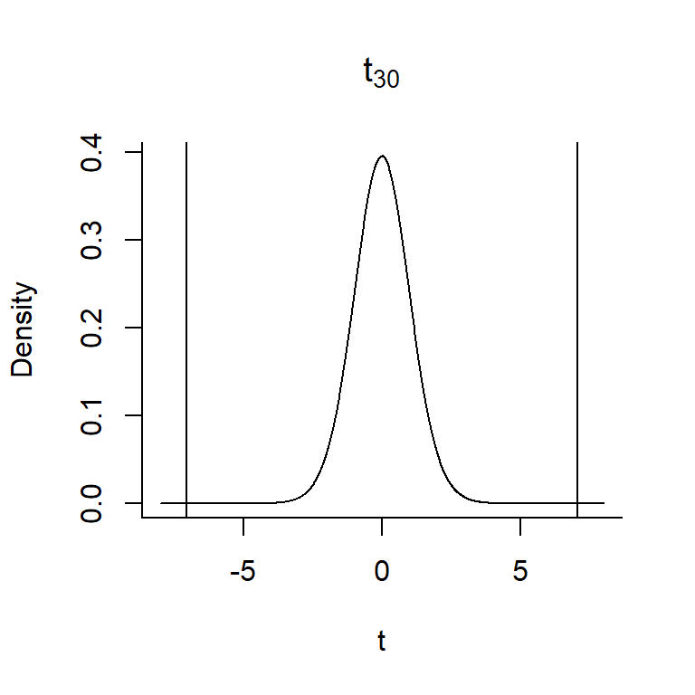
FIGURE 1.17: The p-value associated with the null hypothesis that \(\beta_1 = 0\) versus \(H_A: \beta_1 \ne 0\) is given by the area under the curve to the right of 7.053 and to the left of -7.053.
In this case, our \(t\)-statistic falls in the tail of the \(t\)-distribution – the probability of getting a t-statistic \(\ge 7.03\) or \(\le -7.03\) is very close to 0 (so, the null hypothesis is unlikely to be true!). In Section 9, we will learn about functions in R that will allow us to work with different probability distributions. We could calculate the exact p-value in this case as 2*pt(7.053, df=30, lower.tail=FALSE) = 7.68e-08. Thus, we can reject the null hypothesis that \(\beta_1 = 0\).
Still feel unsure about what a p-value measures? For another entertaining video from our AP stats teacher, this time discussing p-values, see Figure 1.18.
FIGURE 1.18: Explanation of p-values by Mr. Nystrom, an Advanced Placement Statistics Instructor.
1.11 \(R^2\): Amount of variance explained
Lastly, we might be interested in quantifying the amount of variability in our observed response data that is explained by the model. We can do this using the model’s coefficient of determination or \(R^2\). In the case of simple linear regression (models with a single variable), \(R^2 = r^2\), where \(r = cor(x,y)\). To understand how \(R^2\) is calculated, we need to explore sums of squares. Specifically, we decompose the total sums of squares (SST), representing the overall variability in \(Y\), in terms of sums of squares/variability explained by the model (SSR) and residual sums of squares (variability not explained by the model):
SST (Total sum of squares) = \(\sum_i^n(Y_i-\bar{Y})^2\)
SSE (Sum of Squares Error) = \(\sum_i^n(Y_i-\hat{Y})^2\)
SSR = SST - SSE = \(\sum_i^n(\hat{Y}_i-\bar{Y})^2\)
\(R^2 = \frac{SST-SSE}{SST} = \frac{SSR}{SST}\) = proportion of the variation explained by the linear model.
To explore these concepts further, you might explore the following shiny app:
https://paternogbc.shinyapps.io/SS_regression/
If you look closely at the summary of the linear model object, below, you will see that there are actually 2 different \(R^2\) values reported, a Multiple R-squared: 0.6238 and Adjusted R-squared: 0.6113. The \(R^2\) above refers to the former. We will discuss differences between these two measures when we discuss multiple regression (see Section 3.4).
##
## Call:
## lm(formula = age ~ proportion.black, data = LionNoses)
##
## Residuals:
##     Min      1Q  Median      3Q     Max
## -2.5449 -1.1117 -0.5285  0.9635  4.3421
##
## Coefficients:
##                  Estimate Std. Error t value Pr(>|t|)
## (Intercept)        0.8790     0.5688   1.545    0.133
## proportion.black  10.6471     1.5095   7.053 7.68e-08 ***
## ---
## Signif. codes:  0 '***' 0.001 '**' 0.01 '*' 0.05 '.' 0.1 ' ' 1
##
## Residual standard error: 1.669 on 30 degrees of freedom
## Multiple R-squared:  0.6238, Adjusted R-squared:  0.6113
## F-statistic: 49.75 on 1 and 30 DF, p-value: 7.677e-08References
Whitlock & Schluter (2015) use this data set to introduce linear regression and to highlight differences between confidence intervals and prediction intervals (see Section 1.9). Whereas Whitlock & Schluter (2015) emphasize analytical formulas (e.g., for calculating the least squares regression line, sums of squares, standard errors, and confidence intervals), our focus will be on the implementation of linear regression in R. In addition, we are assuming that most readers will have already been introduced to the mechanics of linear regression in a previous statistics class. Our primary reason for covering linear regression here is that we want to use it as an opportunity to review key statistical concepts in frequentist statistics (e.g., sampling distributions).↩︎
We can also get additional information about the data set from its help file by typing
?LionNoses↩︎Note, we use the
I()function to create our new variable within the call tolm, but we could have usedmutateto create this variable and add it to our data set instead.↩︎An estimator is a method of generating an estimate of an unknown parameter from observed data.↩︎
One might even say it fits to a t…yes, I love dad jokes.↩︎
We may refer to a data generating process (DGP)↩︎
For hypothesis tests that do not involve a population parameter (e.g., tests of Normality or goodness-of-fit tests), we may need to use other methods (e.g., simulations) to evaluate the extent to which deviations from the null Hypothesis impact our inferences.↩︎